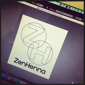
Any new venture requires a logo. ZenHenna has so much potential from a design standpoint that it’s hard to figure out where to start. I tried some sketches with fancy lettering with the intent to use Zentangle and Henna-inspired designs within them, but the fancy lettering was too complicated. At the moment, I’m zeroing in on a concept like this where I can tangle within the Z, use henna designs within the H, and some sort of fusion in the intersection, which could stand alone as a tangle foundation. I have fonts to consider, whether to design within the letters or around them, and even if this concept works. I thought as part of the journey, I’d share the progress on this and see if it helps me think through the options.
I encourage and appreciate sharing!:
Comments are closed.