…because it’s not that easy being (or tangling) green. This week’s I Am the Diva challenge #209 is “Saint Patty’s” with the instruction to go green.
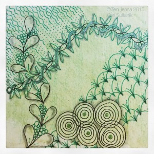
Welllll….first I tried this tile with a mixed green watercolor pencil wash and a compilation of tangles evoking thoughts of spring. (I am so far from Irish it felt inauthentic for me to jump right into shamrocks, but I later gave into the temptation.) With my trusty microns (black and green), I went freestyle–no string–and came up with this hot mess.
It’s only fair to post failures too so as not to discourage new Zentangle students. Tangles include flowervine, flux, ripple, msst and seedings (note to self: there are wayyyyy too many competing elements here).
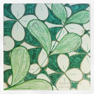
 So, I went to the obvious and tried this lucky background with flux, and though I don’t hate the result, I do wish I had had a micron wider than 01 for the green shades areas in the background.
It kinda looks like a 5-year-old colored it. I added some gelly roll highlights and colored pencil. Meh.
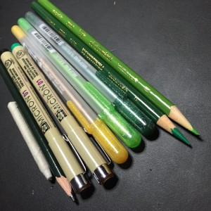
I snapped a pic of the materials used for these because that was the prettiest pic of the bunch.
Fail forward, my friends.
I encourage and appreciate sharing!:


Now how would Kermit build a tangle homage to the Rainbow Connection?
Challenge accepted. Stay tuned. It might end up as a “queer” tattoo. And I don’t mean bad.
Doesn’t it suck when it feels like it just doesn’t want to go where you want it to go. Blegh!
Awesome that you posted it anyway, even for people (like me :D) who are not newbies anymore it’s sometimes nice to see the tiles people aren’t fully happy with 🙂
I don’t think it’s all that bad though, but I agree that it’s not your most amazing tile 🙂
Love the Lucky Flux one! Coloring with a 1 pens is very very tedious!
Much appreciate the support! And thank you for your kind words.
Don’t be too harsh on these little guys… they may ‘grow up’ in a few days. Everyone has those “meh” tiles now and then. I find that if I put mine away for a while, when I come across them again I have forgotten what I wanted or intended for them to look like (and they did not live up to) and I like them much better than I did to begin with. Thanks for sharing.
That’s a good point. I have had a few that I put away with disgust and then spruced up later and ended up liking them.
I wouldn’t say that they were terrible…I have had many that were MUCH worse. And I love the color anyway…that’s quite an array of tools that you used. The lucky flux was a great look. I finally broke down and used my watercolor pencils on them because I don’t like coloring with the pens. But don’t be hard on yourself, they look pretty good to me.
Thank you 🙂 Being hard on myself has always held me back, so I’m trying to just go with what comes of each effort and see what becomes of it.
Both are pretty, but I agree with you that the second of is more pretty to look at. I have the same problem as you with coloring with some microns 01. If possible I use a Identy pen, because I think the coloring is much better.
Indeed. I just bought a set of Prismacolor markers but I have Copics on order and I cannot WAIT to get my hands on those.
We often have expectations of how we want something to look, but no one else understands that…so to us it’s beautiful! Nicely rendered…I especially like your second one.
Thanks so much, I sincerely appreciate that!
I like the first one, and I agree with how those .01, don’t seem to shad the large areas very well. I have had the same problem, and have used some color pencil over the top to help remedy the blotches here and there.
I’m with you there – needs help with the coverage. I have to see if the prismacolors help or if not, wait until May when my Copics arrive. Can. Not. Wait.