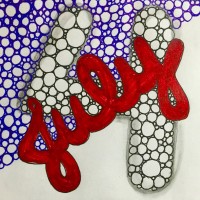
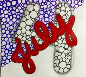
Again, with only office supplies at the ready, I took a quick stab at this week’s Diva challenge: Tipple Monotangle. Since I was so very late with my Umble Panda and Umbles and Ruflz last week, I thought that I might take an early approach on this one. My sincere hope is to revisit and take another shot, but given how quickly last week got away from me, I didn’t want to take any chances.
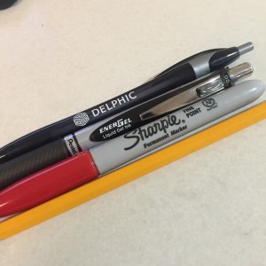
 A note on the supplies here: We’re talking copier paper, a Pentel liquid gel ink pen, a blue ballpoint pen, and a red sharpie, plus a number 2 pencil. Not exactly high end supplies, but the idea I had was an Independence Day theme (July 4), and I had the right colors on hand (the only other choice was highlighters and I just couldn’t do the technicolor approach.
And here it is…Oh how I hope to have time to give this challenge another go!
[Update]
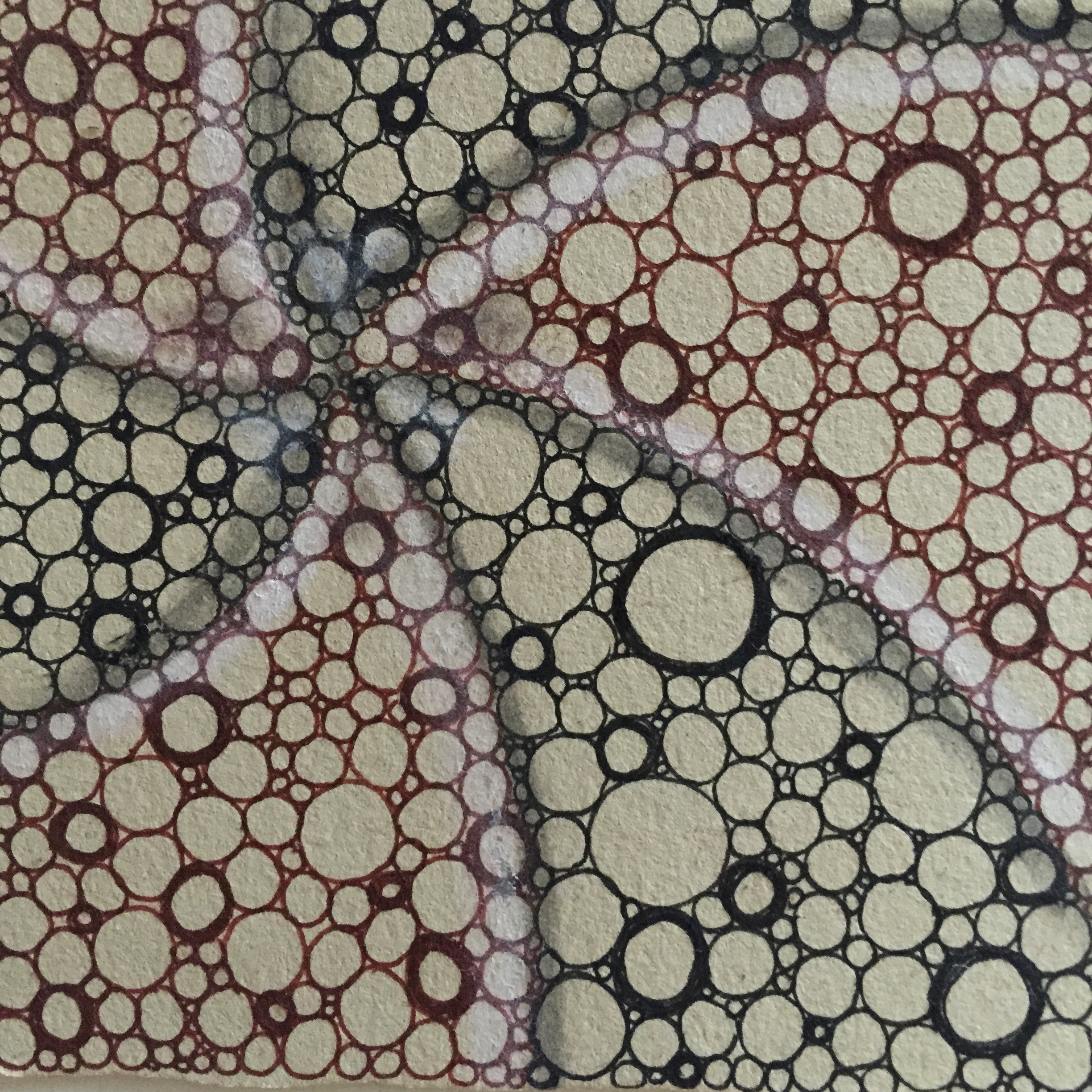
Aaaannnnd a “proper” tile. Renaissance tile with Sakura microns (black and brown) soapstone and soft pencil.
Happy Monday!
I encourage and appreciate sharing!:


Such a nice bold piece! The Tipple adds texture and that red is just so juicy. Happy 4th!
You too, Jean!
Well if this is what you can do WITHOUT the “proper” materials, i await the improved version with bated breath.
That is high praise! I’m humbled and grateful!
I like your bold Tipple!
Like both tiles, but your Renaissance version is my favorite 🙂
Gorgeous tiles.. I especially love your second one <3
Have a great week C 🙂
Thank you, D!
See? We can tangle anywhere! Love it, but I do really love the Renaissance version. Awesome!
Thank you!!
You know what they say—-all you need is a sandy beach and a stick 😉 I think all your versions of Tipple came out really well. There’s something especially relaxing and satisfying about Tipple—-maybe that it doesn’t tax my sometimes feeble brain. If I ever get to teach a class, I think I might start with Tipple just to give people confidence.
You’re SO right, Suzanne. I agree…it’s a perfect beginner tangle. I tried to start one student with Crescent Moon thinking it was quite simple, but didn’t realize it wasn’t intuitive to put the half circles up against the string. You literally cannot get Tipple wrong, so it’s a great one to start with.
The July tile with Tipple was great with the fun lettering.
And your earth-toned tile was a knock-out. Really beautiful. Sarah.
Thank you, Sarah!
Both are wonderful! Especially I like the second one with its beautiful shading and highlighting!
so beautiful
Both of these tiles are so beautiful – I can’t decide which one I like best. Ummmm- both!
Love your renaissance tile for the colour and shading!
Oh these are so well done! The 3-D effect on your 4…and the second piece looks like it is under glass. So neat!
So fun! Love the shading on the ‘4.’
Your “July” tile is just plain fun, and if you grab what you have at hand, great! Your Renaissance tile is really beautiful. The subtle colors look great with the Tipple swirl. Very nice!
Thank you so very much!
Beautiful Tipples !
Nice pinwheel effect with your Tipple tile.
Both tiles are lovely!! I do LOVE the second one in its subtlety!! 🙂
~ Diane Clancy
http://www.dianeclancy.com/blog/2015/06/my-diva-monotangle-tipple-challenge-entry